Over the
years of using InDesign regularly for client and in-house
projects, OPP has four “tips and tricks” to help streamline your work with
InDesign. These tips aren’t ground-breaking, but we’ve found them especially
helpful and hope you will, too.
“Tips
and Tricks” #1: Paragraph and Character Styles
When
working on multi-page documents for our clients, paragraph styles is an essential
function InDesign offers. Paragraph styles shape the document as it’s
assembled, and allows for quick and efficient adjustments.
In the Paragraph Style Options (Figure 1), all
aspects of the paragraph format can be set, from font settings to underline
options. For more reliable and faster editing, any Paragraph Style (F11 or PC, ⌘+F11 for Mac) can be copied and applied to
another.
For
example, a subhead and accompanying body copy are likely to share many
properties, and you can replicate this style throughout the document. Also, it
takes minimal effort to change a typeface midway through a project with this
function.
In this
example, the header style was set based on the body style, since there are only
minor differences. It’s also possible to set the style of the next paragraph;
here the next style is Subhead since one
will follow each header.
Figure 1
Focus on
the Basic Character Formats section next.
Plan to format the base font for the entire document here. When specific
character styles are required, use Character
Styles to “override” the paragraph settings.
As a
general rule, application of Character Styles
(Shift + F11 for PC, ⌘+Shift+F11
for Mac) should be limited to full sentences or less. Editing the appearance of
hyperlinks in keeping with your style guide, for example, is a good use of
character styles. With Character Styles,
you can control every aspect of appearance and, if adjustments are needed, they
can be done all at once.
In the Character Style Options (Figure 2), styles
can be modified to bring attention to selected text. In this example, the
hyperlink style is modified from the body text.
Figure 2
Paragraph
styles are an important element when creating a Table of Contents (TOC). The
hierarchy of the TOC is specified based on paragraph styles; in a standard
document, the first level is the header style, the second level the subhead
style, and so on.
Paragraph
styles are selected and added to the TOC with the Table of Contents settings box (Figure 3). Once the hierarchy is
set, you can format the TOC itself and set it in the document. The TOC can
mimic the paragraph styles included or have its own style.
Figure 3
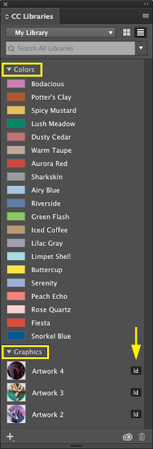
 Creative
Cloud Libraries will sync your frequently-used assets (colors, styles, and
logos) across your entire CC account. This includes the popular Adobe products
– Photoshop, Illustrator, InDesign. The CC Library organizes your assets to
increase the accessibility of elements you use on a regular basis across
different programs.
Assets
are imported by simply dragging the item into the Libraries Panel, where they are automatically organized by type and
identified by the program used to create it
(Figure 4).
“Tips
and Tricks” #4: Calculate Values in Panels and Dialog Boxes
We’ve
found this tip to be quite handy, especially to reduce human error when
creating a grid. Instead of calculating distances between grid lines, for
example, just add the desired distance in the dimension text box and InDesign
will automatically calculate the new location. In the example here (Figure 5),
the object will be moved 2p6 to the right and down. Select Constrain Proportions if you want to maintain the proportions of
your grid when editing the height or width.
Figure 5
We hope you found some benefit from this post. We are proud of
the many awards our clients have won for the OPP support creative
materials—many of which were done in InDesign.


